Average Mood by Day of the Week and Time of Day
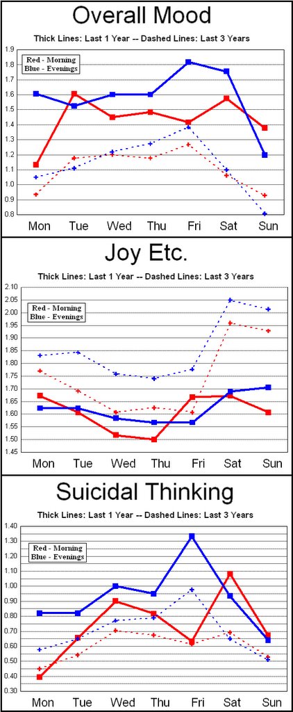
I've crunched a zillion numbers to come up with these graphs illustrating my average ratings for each day of the week. The red lines indicate morning scores while the blue lines indicate evening scores. Dashed lines represent my 3-year average; solid lines represent the past year. The most obvious conclusions are: 1) Mornings tend to be better than evenings; 2) Friday evenings are the worst; and 3) The past year was significantly worse than average. (Remember: high scores are "bad" except on the Joy Etc graph.)
[There may be an easier way to do this, but to enlarge the picture try the following: click on it once; after it fully reappears in a new window, hover the mouse over the picture and click on the  icon that appears in the lower right corner. At least in Internet Explorer this seems to work.]
posted by Monte @ Saturday, March 11, 2006
0 comments
![]()


0 Comments:
Post a Comment
<< Home